Latam airlines
fast-check
Simplifying and speeding information checking in Latam Airlines app.

Position: UX Designer
Tools: Figma
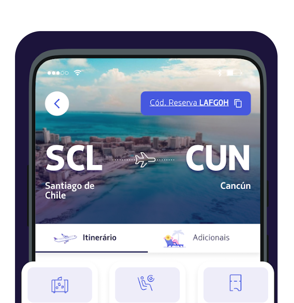
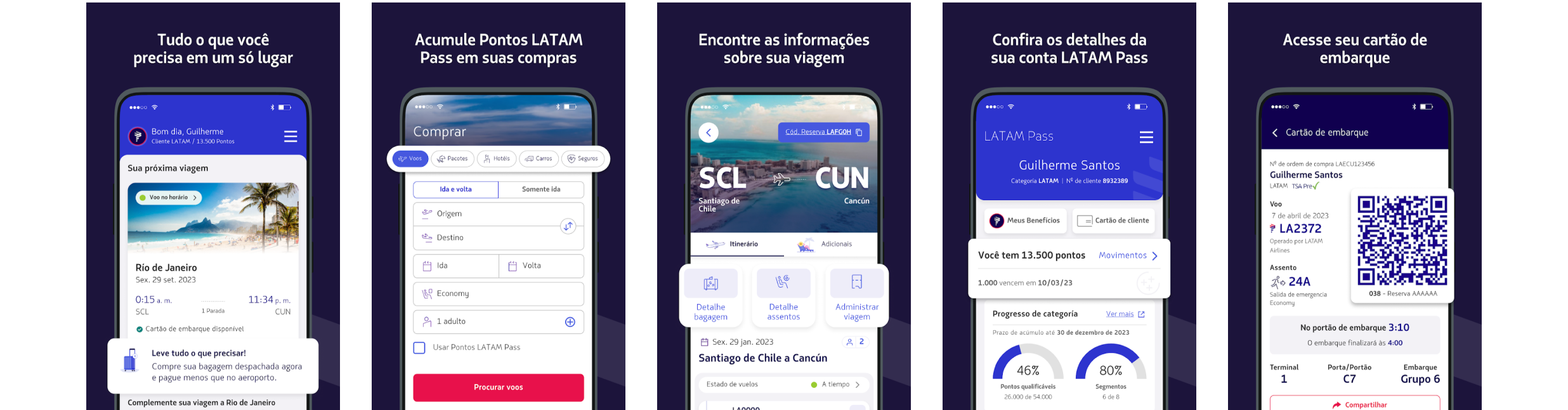
Latam Airlines app delivers great UX writing during precise moments calling travelers’ attention to the phone. Investigating the app revealed:
Looking for the gate, Seat confirmation and Luggage dispatch. All needed to be more accessible. Not relying solely on text based interaction.
problem
Project
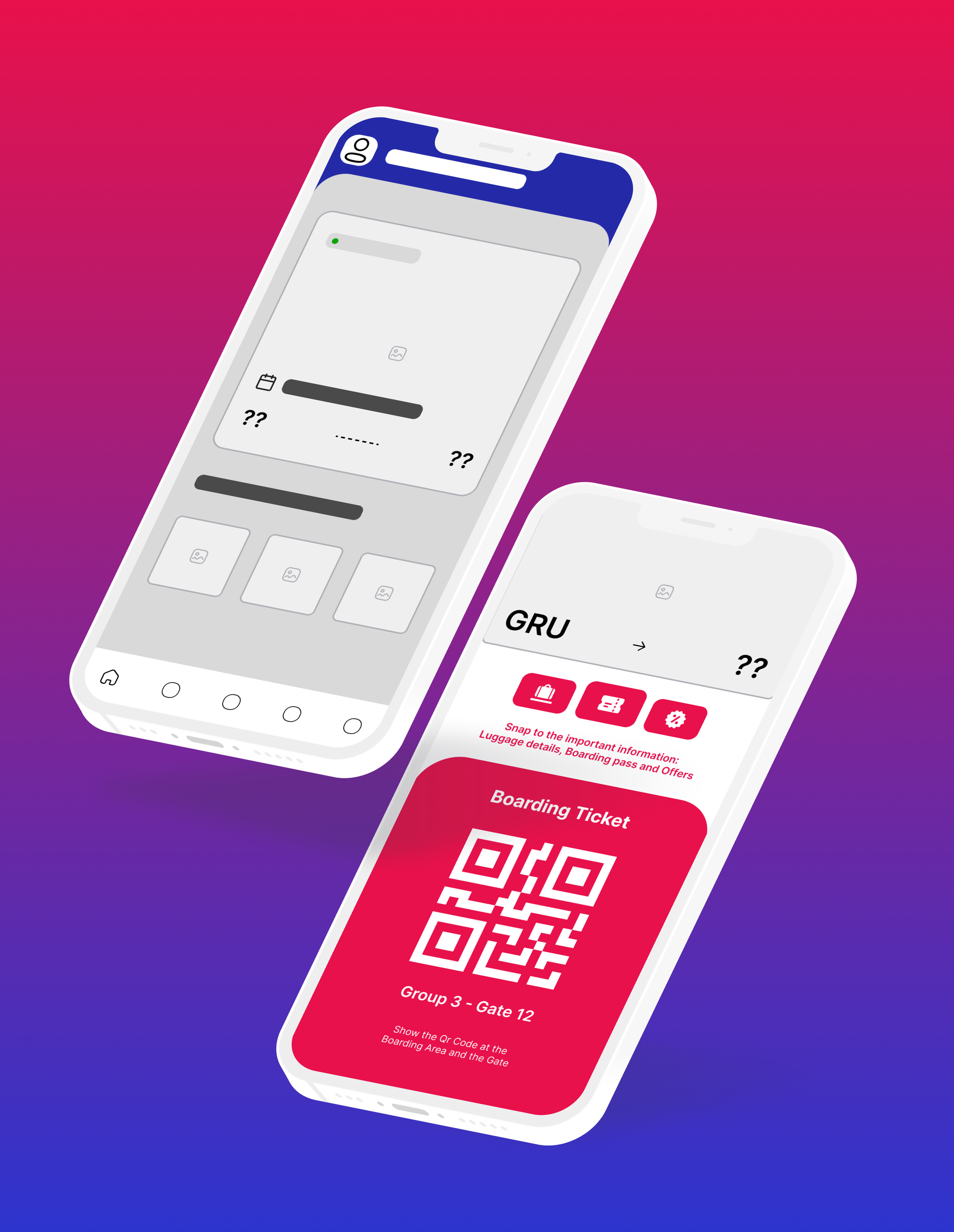
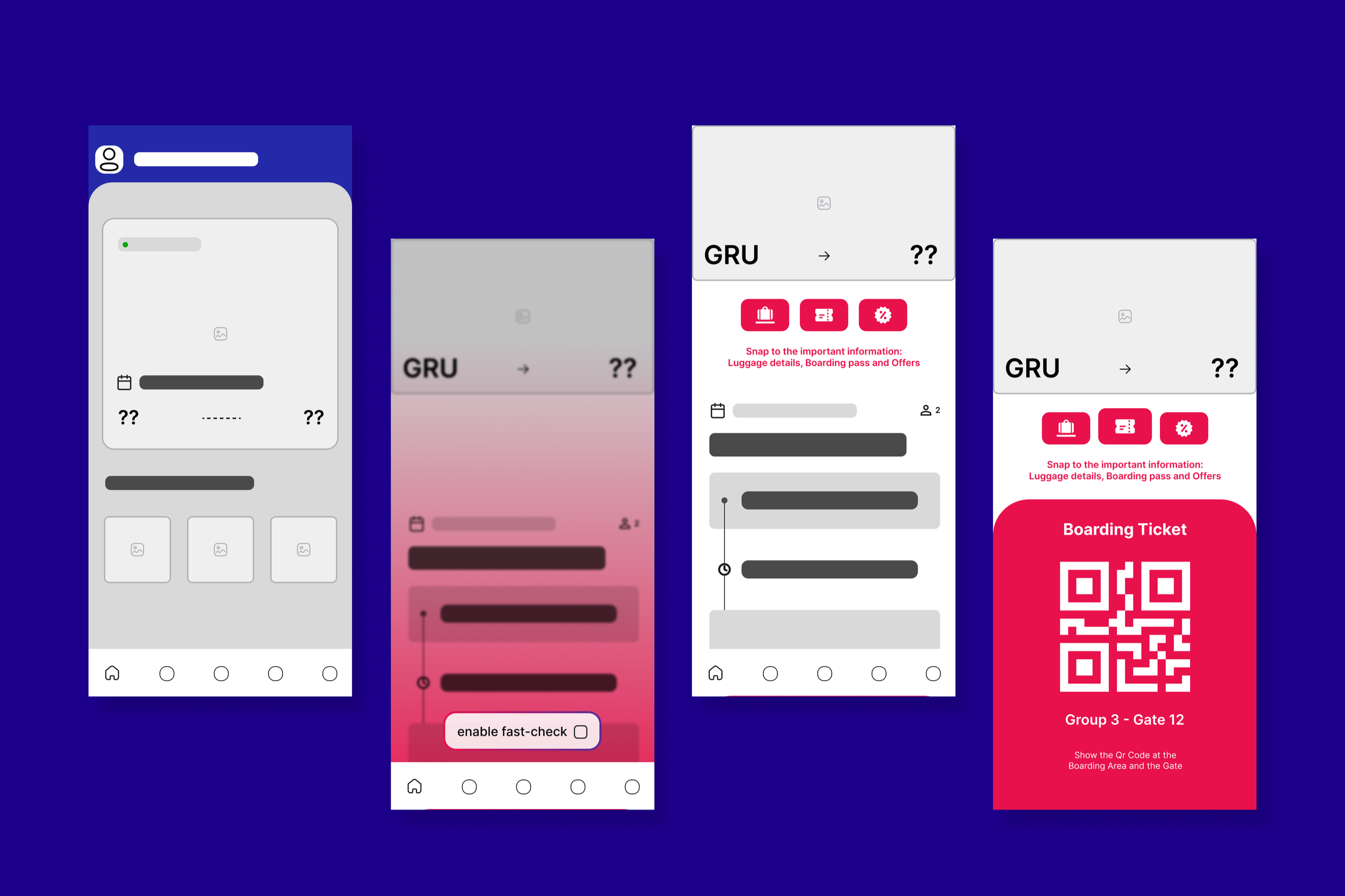
Following these observations, it is proposed A shortcut system to move across different screens’ information.
enabling the user to have the most important information in one single space.
Objective
I sought to implement a functionality that could help the app on providing digital safety and user fidelity.

user journey
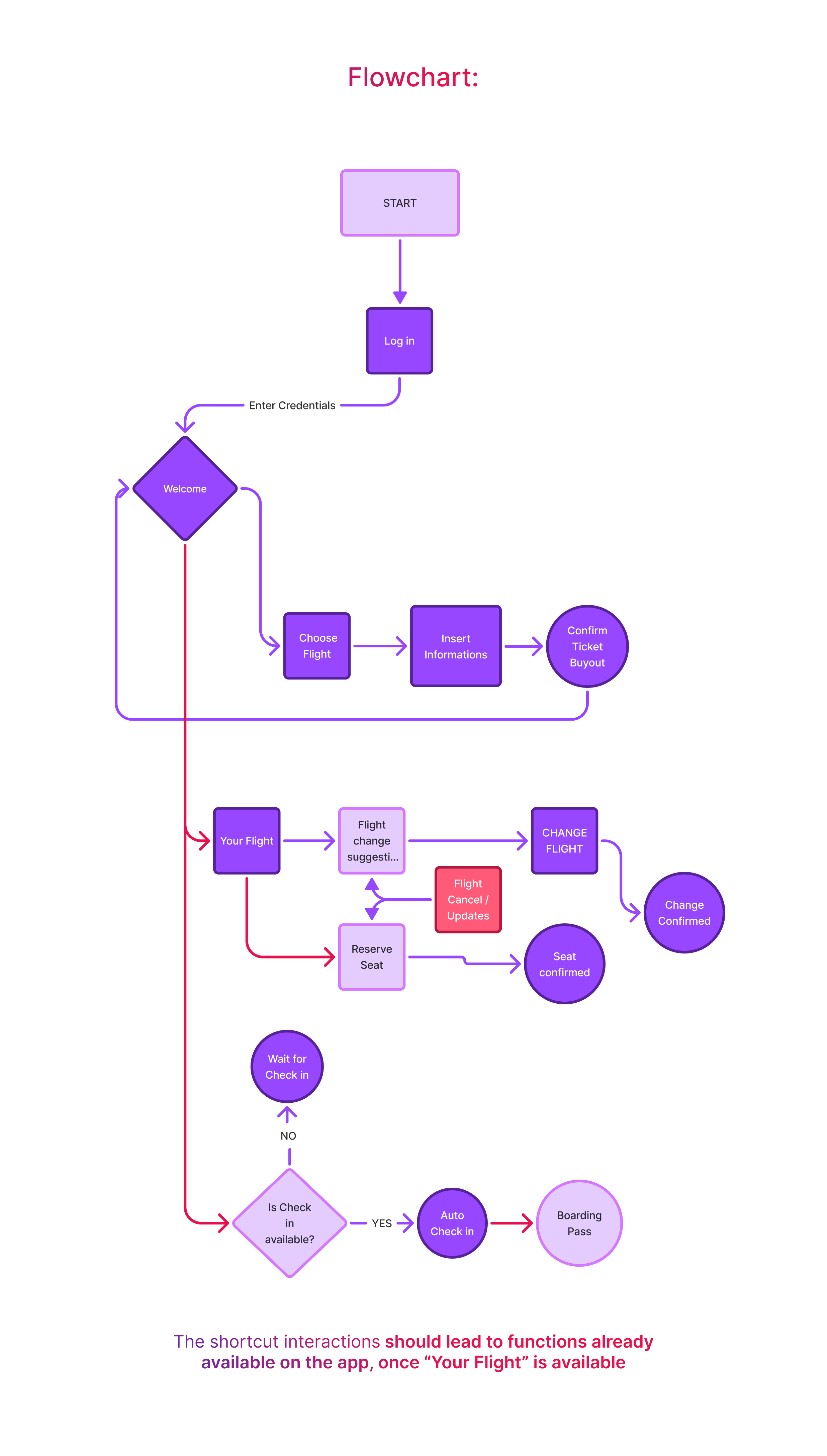
The steps to be affected by the project’s flow proposal are shown in pink color.
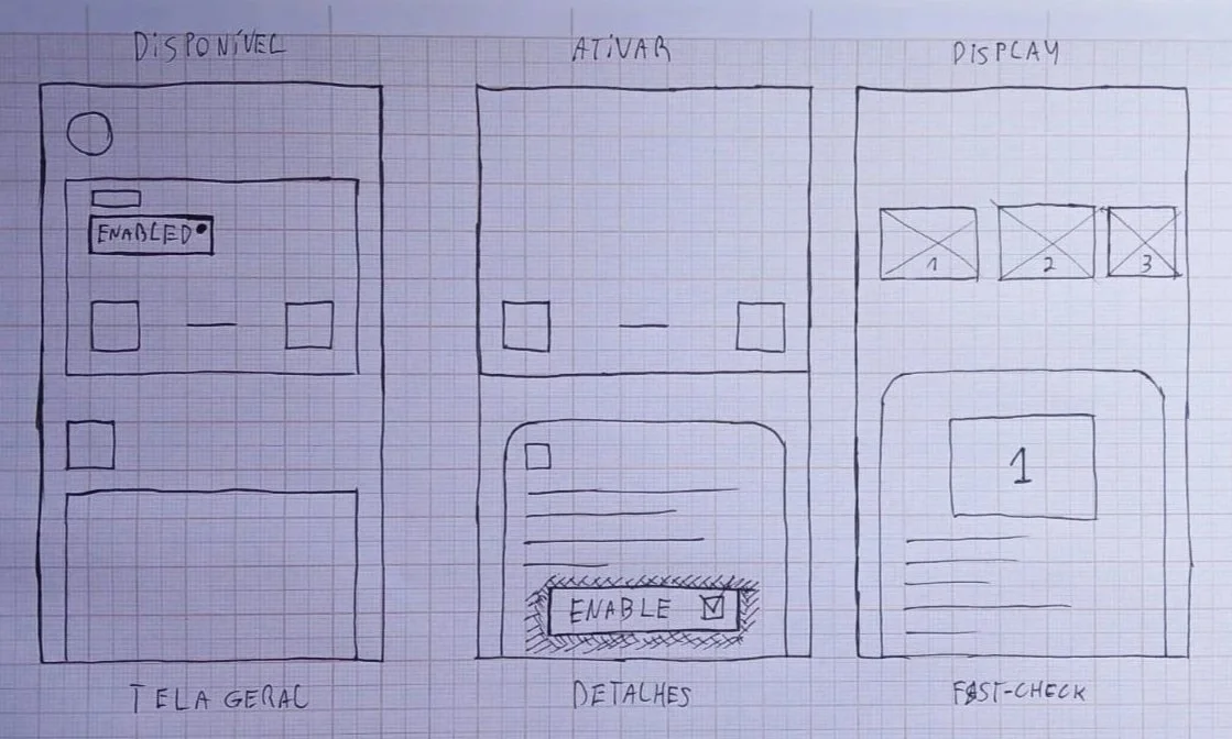
wireframing and screens
user testing
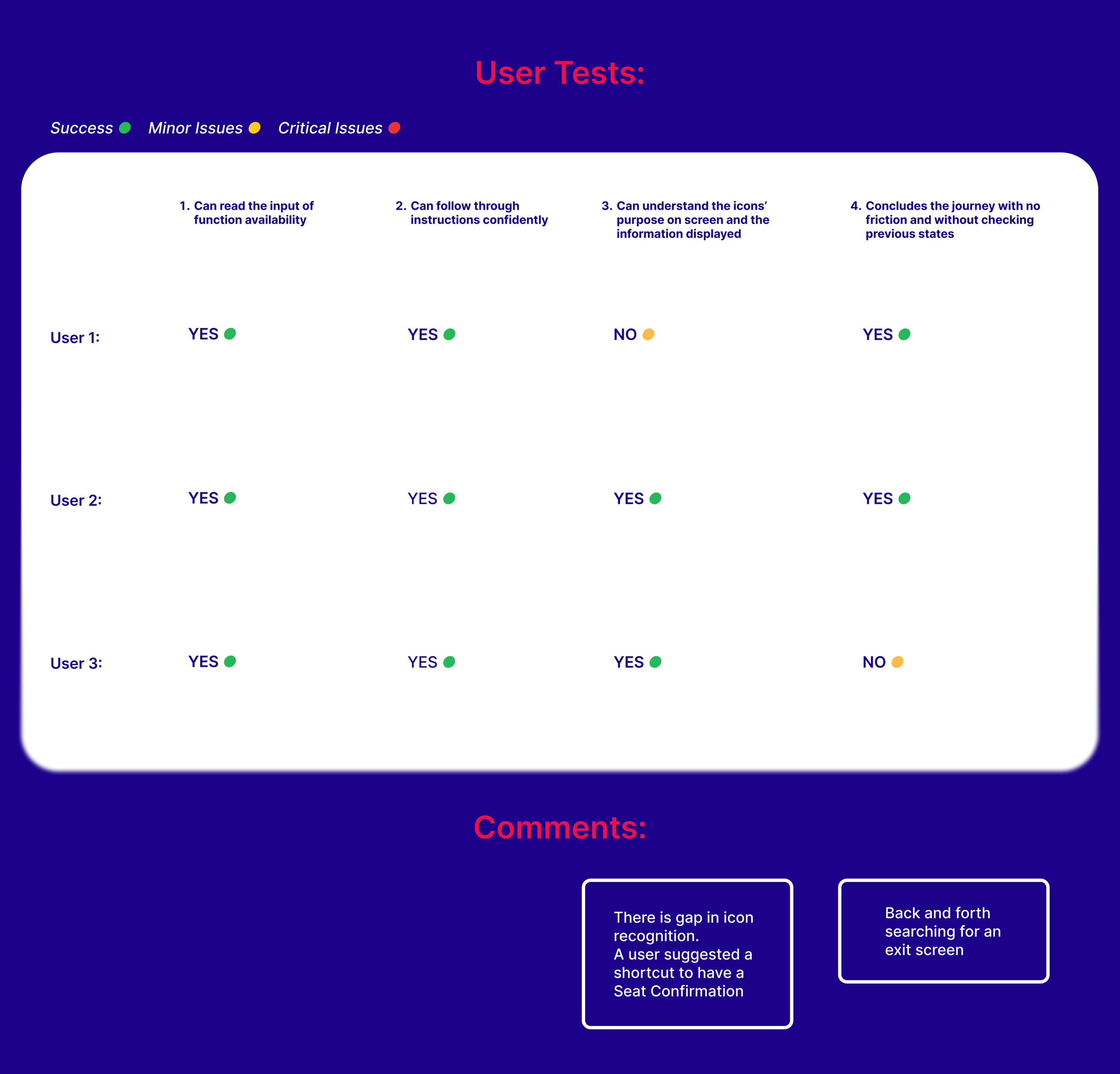
A user test was conducted with 3 participants with 4 criterias to be filled.
The task success rate = 83%
No critial issues were found. Users understood the value of the project.
Observations showed that some icons could be improved for faster readability.
Changes were carried to the prototype, decreasing the number of screens and inputs.
prototype
Context:
You have just reached the airport, took your luggage from the car, looking to update yourself on the status of your flight.
The crowd on the airport is pressing, you need to look for:
luggage capacity information,
Have your boarding ticket available
Your account on Latam Pass service.
takeaways
It was revealed during research that some interactions, buying tickets for example, are still a problem for many users.
This project has the possibility to introduce customization. Letting the user create their own shortcuts